

Home Page
At the beginning of the re-design, we interviewed both current and new readers which resulted with a list of pain points. Some of them were small like needing one line of copy, while others were huge, like a complete inability to find things and new users wanting to bounce if they didn't like the one above the fold article that took up the entire screen. I mixed these results with ideas collected from the design sprint and survey data to dive deep into the home page redesign.
We had four different phases of the redesign, each phase ended with a usability test. The first two tests were with new users because I didn't want the context of the content to sway the results. The last two tests were with the current users because we needed users to understand the context of the content.
Defining the Problems
Design Sprint
My first step was to get everyone on the same page so I kicked off the redesign with a design sprint that included the editorial, engineering, marketing and digital team.
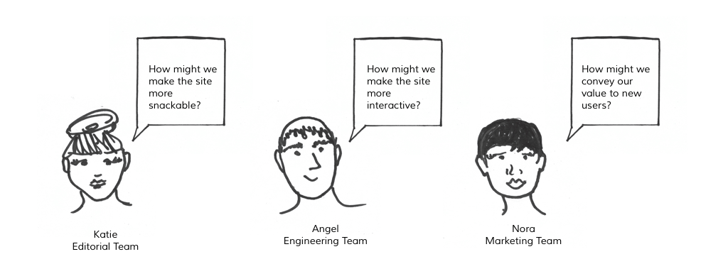
Other goals:
- Make content more exciting
- Improve engagement
- Show how FA can improve their work/life
- Display more recent content
- Reduce scrolling
- Driver readers to older archives
- Surface content that isn't that old (a week old)
Process

First Prototype
The first step I took was create a list of modules that we wanted to test/include on the home page. I knew that I wanted to test two different layouts for the first usability test. First was a list format with a list of articles on the left and a smaller side bar of modules on the right. The second format was a blocked version of the modules.
I went old school, and created a paper prototype. This made it easier for me to visualize the layout and move content around. I cut out a mixture of formats and sizes for each module and swapped out their positions until I was satisfied. Once I was done, I did a rough mock-up and tested them on new users. Mixing the usability test's feedback with the teams' opinion, we decided to build out the block format.

2nd Prototype
I feel like I should invest in 3M, because I use so many post it notes. For the 2nd prototype, I played with hierarchy. I listed the importance of each main module and broke out it's different parts. I collected data from surveying both current users and internal teams to figure out each placement. I tested to see if new users respond well to the hierachy as well as the blocked modules.

Third Prototype
For the third round of testing, I decided to switch to current users because the context of the content became more relevant than the layout. I was the most surprised to hear people say that it was very similar to the current page which was funny because only one module remained the same. I took this a a good sign that they were not overwhelmed by the changes.
Solutions
After our validation test and a last sweep of internal critiques, we were ready to launch. This is what we came up with:
Above the fold
Before
After

I was conducting the very first usability tests when Trump just got elected and our featured article was his giant head yelling at a crowd. When one new user saw it, he immediately stated that he would bounce from the site. I realized that Foreign Affairs was placing too much faith into one featured article to represent the full amount of content and this insight spurred the above the fold redesign.
One problem that Foreign Affairs has is that it typically only publishes three articles a day. I couldn't take a modern newspaper's approach and stuff the page full of articles. Four articles seemed like the perfect number, it would have the newest as the featured article and then a few articles from today and yesterday.
Interactions

The original design was very stagnate. A user could only click on something and go directly into an article. We wanted to create a module that a reader could engage with so I built out the "Countries in the Spotlight" module where readers can click on capitals of countries that are trending in the news.
Audio

Readers have been going bonkers over Foreign Affairs' newly released audio section. With the old design, readers had to go into each article to play the audio. After each article they would have to go find another article to listen too and the articles are not that long. To solve this problem, I designed an audio module for the home page.
Surfacing more content
Before

After

One of our main goals to show more value to our readers. The most valuable things we have to offer are our articles. Naturally, this lead us to the strategy of designing to display more content. The original site had roughly 21 articles/media that readers could click on. The number is roughly because editorial has the ability to change around the home page based on the current days news. The new design has 43 articles/media. That's over 50% more content.
A good example of how we built out this content was with the book reviews. During the third round of testing, one user stated that the featured book wasn't something that he was interested in and that he would most likely scroll past this section. Then one of the side books caught his eye and he said that he would click on it and read the book review. When we give readers more content, they are more likely to find something that they want to read.
Final Thoughts
The home page is currently being built and the first phases of A/B testing will begin in November 2017. We are going conduct the testing in chunks so that we can collect data on individual modules.